ToggleButton
ToggleButton là loại View hiện thị hai trạng thái on, off (checked, unchecked) nó kế thừa từ CompoundButton nên cách sử dụng của nó giống với CheckBox chỉ là cách hiện thị thông tin khác nhau một chút (nên về chi tiết, cách triển khái ban đọc: CheckBox Android trước)
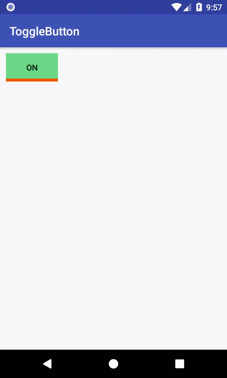
ToggleButton mặc định hiện thị một dòng text (cho biết trạng thái on, off: ví dụ ON/OFF, BẬT/TẮT ... dòng text này do bạn thiết lập), đồng thời một dòng kẻ phía dưới
<?xml version="1.0" encoding="utf-8"?>
<LinearLayout xmlns:android="http://schemas.android.com/apk/res/android"
android:layout_width="match_parent"
android:layout_height="match_parent"
android:padding="10dp">
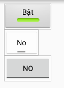
<ToggleButton
android:id="@+id/toggle1"
android:layout_width="wrap_content"
android:layout_height="wrap_content"
android:checked="true"
android:textOff="Tắt"
android:textOn="Bật" />
<ToggleButton
android:id="@+id/toggle2"
android:layout_width="wrap_content"
android:layout_height="wrap_content"
android:checked="false"
android:textOff="No"
android:textOn="Yes" />
</LinearLayout>

Cách triển khai XML, code Java tương tự như phần CheckBox với các phương thức như: isChecked, setChecked, setOnClickListener ...
public class MainActivity extends AppCompatActivity {

    @Override
    protected void onCreate(Bundle savedInstanceState) {
        super.onCreate(savedInstanceState);
        setContentView(R.layout.activity_main);

        ToggleButton toggleButton1 = findViewById(R.id.toggle1);
        ToggleButton toggleButton2 = findViewById(R.id.toggle2);

        toggleButton1.setChecked(false);
        toggleButton2.setChecked(true);

        CompoundButton.OnCheckedChangeListener listener =
        new CompoundButton.OnCheckedChangeListener() {
            @Override
            public void onCheckedChanged(CompoundButton compoundButton, boolean b) {
                switch (compoundButton.getId()) {
                    case R.id.toggle1:
                        Toast.makeText(MainActivity.this, "Nút 1:" +
                            compoundButton.isChecked(),
                                Toast.LENGTH_SHORT).show();
                        break;
                    case R.id.toggle2:
                        Toast.makeText(MainActivity.this, "Nút 2:" +
                                compoundButton.isChecked(),
                                    Toast.LENGTH_SHORT).show();
                        break;
                }
            }
        };

        toggleButton1.setOnCheckedChangeListener(listener);
        toggleButton2.setOnCheckedChangeListener(listener);

    }
}

Một số thiết lập
-
Thiết lập style
Có sẵn một số kiểu thể hiện ToggleButton có sẵn trong thư viện bạn có thể sử dụng như:
- style="@android:style/Widget.Button.Toggle"
- style="@android:style/Widget.Holo.Light.Button.Toggle"
- style="@android:style/Widget.Material.Button.Toggle"
-
Tùy chọn hiện thị
Tương tự CheckBox, RadioButton ... bạn có thể thiết lập
android:backgroundgán một Selector trong đó chứa các Drawable cho các trạng thái checked/unchecked. Ví dụ có:drawable/toggle_state_on.xml<?xml version="1.0" encoding="utf-8"?> <layer-list xmlns:android="http://schemas.android.com/apk/res/android"> <item> <shape android:shape="rectangle"> <stroke android:color="#ef5400" android:width="5dp" /> </shape> </item> <item android:bottom="5dp"> <shape android:shape="rectangle"> <solid android:color="#6dd988"/> </shape> </item> </layer-list>drawable/toggle_state_off.xml<?xml version="1.0" encoding="utf-8"?> <layer-list xmlns:android="http://schemas.android.com/apk/res/android"> <item> <shape android:shape="rectangle"> <stroke android:color="#97928f" android:width="5dp" /> </shape> </item> <item android:bottom="5dp"> <shape android:shape="rectangle"> <solid android:color="#a9b7c1"/> </shape> </item> </layer-list>drawable/toggle_custom.xml<?xml version="1.0" encoding="utf-8"?> <selector xmlns:android="http://schemas.android.com/apk/res/android"> <item android:drawable="@drawable/toggle_state_on" android:state_checked="true" /> <item android:drawable="@drawable/toggle_state_off" android:state_checked="false" /> </selector>Sau đó thiết lập vào ToggleButton bằng: android:background="@drawable/toggle_custom"